Wow, Did My Pitch Deck Suck

Since becoming an investor, I’ve reviewed thousands of startup decks and helped hundreds of founders prepare their pitches. But long before I was a VC, I cofounded DataHero, the world’s first cloud BI company. I recently came across one of our old fundraising decks and boy, did it suck!
Let’s take a trip down memory lane and look at all the mistakes we made in that deck.
I’ll review the deck in two passes:
A Slide-by-Slide Review
An Overall (Holistic) Review
After that, I’ll conclude by sharing what the outcome of the round was.
Note: This deck is for a $3.5M “Series A” that we raised in late-2013, following a $965K “Seed” round in 2012. By today’s standards (for both company stage and round size) this would be considered a Seed round (with the prior fundraise our Pre-Seed).
As such, the feedback and recommendations in this post are from the perspective of a Seed investor reviewing a Seed deck.
Here is the full deck for DataHero’s 2013 fundraising round. Flip through it and then we’ll review it in detail…


Slide-by-Slide Review
Let’s start off by going through the slides one-by-one:
Title Slide

DataHero was founded at a time when tongue-in-cheek interfaces were quite popular (e.g. MailChimp had monkeys all over). Our branding was designed around superheroes, with a mid-century look.
The title slide showcases the art style (which we thought was important given our focus on UI/UX) and the background suggests that DataHero is some sort of an analytics product.
The one mistake in this slide is that we used our marketing tagline instead of describing our product and/or market, so it’s not clear what exactly DataHero is or who it’s for.
Slide #1

What did we put on our very first slide…? Another title slide! 🤦♂️
Having a subject title slide like this might make sense if you’re presenting at an academic conference or BigCo™️ event, but in a pitch deck it’s completely unnecessary/redundant.
(If we wanted our names as cofounders at the start of the deck, we could easily have put them in the actual title slide.)
Slide #2

Here’s the real first slide. The opportunity to grab the reader’s attention, like an explosion right out-of-the-gate in an action film.
So what did we do? We shared a company timeline — something that should generally be the second-to-last slide in a deck.
Oh…and the timeline didn’t have any user- or revenue-related achievements.
An effective first slide needs to have impact. It could describe the problem being solved and its scale, present compelling traction metrics, or show impressive customer logos. But it has to draw the reader in and make them want to learn more.
This…ain’t it.
Slide #3
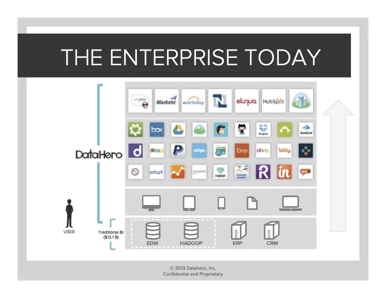
This, on the other hand, is a pretty effective slide.
It frames the problem we were solving by showing the data sources that traditional BI solutions worked with (at that time, primarily on-premise databases and other software) and contrasts that with the many SaaS services BI software couldn’t connect to.
If I were to do anything different with this one, I’d try to find some numbers to quantify those services in some way (how many users do they have? how much do companies spend on them, etc.). We implied that it was a big market by including the size of the traditional BI market, but at that time it was still a leap of faith to quantify the opportunity for DataHero.
Slide #4

This is a strong, concise product statement.
The only way to improve it would be to add market sizing, such as:
“DataHero will be the platform that enables 5 million enterprise users to visualize their cloud data”
or
“DataHero will be the platform that enables enterprise users to visualize 100 PB of data locked away in cloud services”
Slide #5
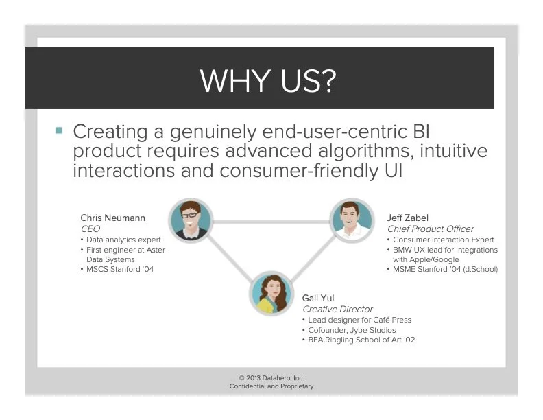
This is another strong slide that answers one of the most important questions early investors have: “Why are you the team to win this market?”
In the case of DataHero, we were building a product focused on a new market: business users who relied primarily on cloud services and needed to better understand the data stored within those systems. We felt that our combination of a CEO with a background in enterprise data software, a well-known UX expert and a creative director who led design at a Sequoia-backed company through IPO perfectly positioned us to develop the right product for this market.
This slide resonated strongly with potential investors.
Slide #6

This was a placeholder slide for demos during in-person / virtual meetings.
There’s obviously no reason to include this slide in a deck being emailed to investors. That said, were we to remove it, we would have needed to add more screenshots of the product (which we should have done anyways, since this is the only screenshot in the entire deck…).
Slide #7

This is a relatively decent “what does your product do” slide, but in hindsight it would have been better if we had replaced the cutesy cartoons with actual screenshots and/or a flow chart describing the user journey.
Slide #8

User/customer quotes are great, but they’re always a bit suspect when they don’t include the name of the company where a user works.
I can’t recall why we didn’t include Ali’s company name here - likely we thought it was too small or unknown. Now that I’m on the other side of the table, I see it through a different lens: you should always include customer names / logos whenever possible (even if you don’t think it’s a “big” name), because it’s an actual customer and you can/should project pride around that!
Everyone has to start somewhere.
Slide #9

Ok, so I just said that user/customer quotes are great…
…but there’s no reason for them to span two slides.
These should be combined into a single slide (with company logos added to each).
Slide #10

This is the first slide in the deck that references traction.
As an investor, the fact that it took so long is going to make me a bit skeptical, especially given that the timeline slide told me that the public launch occurred at least three months prior. We should have gotten to this sooner.
As for the slide itself, one of the biggest questions we faced when raising our Pre-Seed was “would end users pay directly for a data product?” (the number of successful bottoms-up SaaS products was still relatively small at that time). The title was meant to answer that question. The thing is, almost none of the investors we spoke with about our Seed round had met us before - so we were answering a question that they didn’t ask.
As such, they interpreted this slide as us claiming that we had “proven” a market, when it was obvious that we weren’t anywhere close to product-market fit.
All registered users proves is that you’re good at marketing. It says nothing about what happens after signup - is the product actually what people are looking for..?
Slide #11

At first glance, this is a really strong slide. It’s a list of amazing logos of companies that were using our product.
Unfortunately, they represented free users, not paying customers (at the point we raised our Seed round, we had just started to figure out monetization and how to effectively separate our free and paid products).
That said, to a potential investor, this is likely an impressive enough list to result in a first meeting - if only to dig in deeper. At the time, several investors told me that this slide was what resulted in us getting a meeting. The problem was, when they inevitably asked us how many of these companies were paying customers, we would sheepishly say “zero…” which wasn’t a great look.
Slide #12

This is a relatively strong case study slide, with one exception: it’s also talking about free users rather than paying customers. And the wording makes that fact glaringly obvious to an experienced VC.
As an investor, anytime I see a case study slide without any reference to revenue or licenses, alarm bells go off. 🚨
This slide is effective at showing that “land-and-expand” was working for DataHero as a product, however (unbeknownst to us at the time), it also makes clear that we weren’t in control of it — it wasn’t yet working from a sales perspective.
All that said, at the Seed stage, this is still okay — because pricing can be fixed.
Slide #13

Ugh…another slide with “proven” in the title 🤦♂️
I’m not sure why we made this slide the way we did, but in our minds it was important to emphasize how cheap/scrappy/cash-efficient we were.
As a concluding/timeline slide, the bullet points are solid. As a team slide, this is underwhelming (because we don’t include any logos of where our employees previously worked).
Going back to my comment on slide #5 about investors wanting to know why you’re the team to win, anytime you show your team it’s essential to include key details about them. A picture is worth 1,000 words and the best way to do that is to add logos of prior employers, schools, etc.
Slide #14

Conceptually, this go-to-market strategy makes sense.
But as an investor, I’m screaming “where are the numbers?!?” The product has been in market for at least 3 months, slide #10 has fairly impressive registration numbers (at least, for those days), but there’s still nothing concrete about user behaviour, retention or — heaven forbid — revenue.
As an investor, the fact that we’re now on slide #14 and I haven’t seen anything on unit economics is setting off all sorts of alarm bells that nobody is actually using this product (and they’re certainly not paying for it).
Slide #15

This is an interesting product slide, but I immediately want to learn more:
Which integrations were most popular?
What are the retention/revenue metrics for each?
What did you learn by attempting to attract a “diverse base of business users?”
For in-person meetings circa 2013, this was great (because we had answers to all of those and it would steer the conversation in a certain direction). By 2022 standards, this slide needs more depth.
Slide #16

There is literally no reason why this should be a separate slide (vs. combining it with slide #15).
Slide #17

This slide really frustrates me - as it breaks one of the cardinal rules of pitch decks: don’t mix two separate topics on a single slide.
The first section talks about predictors of usage (which hints at our retention / monetization strategy), while the second is about feature requests (or at least it reads that way - it was actually a really awkward way of explaining why the majority of our users didn’t connect a cloud BI product to a…you know…cloud service).
Oh…and still no depth to the numbers.
Some charts and substance around retention would have been great here. Also using plain english to explain that the 75% of users who weren’t connecting to SaaS services were doing so because they were uploading Excel files (from corporate data stores, services we didn’t support yet, etc.) and visualizing them.
Slide #18

Oh, look! Another roadmap slide.
All of this makes sense, but it’s frankly pretty in the weeds and could easily be combined with slide #14.
Slide #19

But wait! You haven’t seen enough roadmap slides yet? Let’s add one more… 🤦♂️
…and what is this one is entirely focused on? Product. Nothing about user numbers, revenue, or any other business metric. Just features and functions.
Interesting stuff to be sure, but by this point as an investor, I’m likely convinced that there are zero active users, zero revenue and I’m skeptical that there’s any plan whatsoever for sales and marketing. Typical technical/product founders building a product without talking to customers…
(The worst part is, we had tons of data from talking to early users and customers, but we weren’t showing it!)
Slide #20

Slide #20.
The second-to-last slide in the entire deck is the first and only time we used the word “revenue”.
FFS.
And even then — this slide shows projections for 2014 and beyond, but there is still no information whatsoever on the revenue DataHero had achieved to-date.
Looking back at my records, at the time of our fundraise our revenue was pretty paltry (we had about 20 paying customers generating around $500/mo in revenue), but it was something. To think that we could “hide” it from potential investors was beyond naive. Even for an early startup, you have to talk about revenue.
In our case, while our revenue was minimal, we actually had a strong free user base and had learned an incredible amount around usage patterns (hinted at in slide #17). The revenue was a lagging indicators because we had the wrong “premium” features at the time — something that’s fairly common for early startups. We should have leaned more into the data we had, rather than shying away from the revenue we felt that we didn’t have.
Slide #21

The final slide: the ask!
…this slide makes me cringe every time I look at it.
It makes two big mistakes:
It doesn’t include anything about what we’re going to achieve with the fundraise (how many users will we attract, how much revenue will we generate, etc. with the funding)
It positions $3M / $3.5M as already secured.
The former is a very common mistake in pitch decks. Founders talk about what they’re going to spend the money on, but not the milestones they’re going to achieve with it. Investors want to know what your plan is for the next 12 - 18 months to understand how you will de-risk the business and position it for a subsequent raise.
The latter point is one where I know we made a big strategic mistake.
Foundry Group, who led our first round, had shared their conviction in DataHero and offered to take down the entire seed round. We wanted to test the market, but didn’t know how/if to leverage Foundry’s offer with other investors.
We thought that we could gain leverage by bragging that “our existing investors think DataHero is so awesome they’re willing to put another $3M in!” but by including it in the deck the way we did, I believe a significant number of investors passed without a meeting because they presumed the lead to be secured. They thought we were looking for a relatively small amount of money to close the round (which wouldn’t achieve their ownership targets) and passed immediately.
Overall Review
Now that we’ve gone through each slide one-by-one, what are the key takeaways?
The Good
Despite the title of this post, there were certainly some things we did right:
The design of the deck was clean and did a good job of reflecting our brand and approach. (There continues to be a healthy debate around whether or not a pitch deck needs to “look good” — I am firmly of the belief that if UI/UX is a key part of your value proposition, the answer is 100% “yes.”)
We did a good job of answering the question “why are you the team to solve this problem?”
We presented the opportunity effectively by contrasting the world today (BI for on-premise data stores) with the world of tomorrow (BI for cloud-based services).
We presented the key features in an easy-to-understand manner while making clear that there was real tech under-the-hood.
We had strong customer quotes in support of the product.
The Bad
By far the biggest overall issue with our pitch deck was the complete lack of metrics. Despite the fact that we were only a few months into market and had almost no revenue, we had a significant amount of data around usage patterns and user retention. At a minimum, we needed a revenue slide (since every investor immediately asked about it), but in reality we could have done a lot to support our progress towards product-market fit by including user data — and we had a ton of it. By committing the sin of omission, we left potential investors free to assume the worst: that we were a heads-down product-centric startup that was good at getting registrations, but not at building a product users actually wanted.
In hindsight, the lack of screenshots was another obvious omission. DataHero was a gorgeous product with a UI that blew away every other BI tool at the time, yet we leaned on illustrations instead of showcasing the product itself.
A third missing piece was a competitive slide. We alluded to legacy competition in slide #3, but there’s no mention of any other analytics tools for SaaS services (DataHero was the first horizontal cloud BI tool, but there were service-specific tools already in market at the time, such as Baremetrics for Stripe).
Ironically, we had all of these slides — we just held them back them for after the first meeting. What we didn’t realize at the time (which I now clearly know), is that by holding back key parts of the story, we lost a lot of potential investors who never opted in to meet us.
In addition to the points above, the overall flow of the deck could be significantly improved. We should have led with the problem statement and market instead of starting with history to make sure we were hitting hard from the start. Revenue/traction definitely should have come earlier and with far more depth. Investors want to know what you’ve achieved (no matter how early in your journey you are), so don’t bury the lede!

This tweet from Paul Graham sums it up nicely
Finally, the deck was way too long. A good Seed deck should be 10 - 12 slides long (14 slides max). In our case, a number of the slides could easily have been combined, which would have made the deck far more concise and impactful. If all the user data we didn’t include made the deck too long, we could have put those slides into an appendix without sacrificing flow.
The Ugly
Including Foundry’s verbal commitment on the slide deck was a monumental error on our part. Instead of having the intended effect of demonstrating strong support from our existing investors, it gave the misconception that the lead investor was already decided and we were only looking to fill out the round.
So What Happened?
In October 2013, we launched our fundraising campaign, with our investors supportively sending out introductory emails to everyone on our target list. A significant majority declined those introductions, which I now believe to be in large part due to (a) the lack of metrics in our deck and (b) the manner in which Foundry’s verbal commitment was framed.
We still met with a good number of investors, several of whom went deep into diligence. Ultimately, the fact that we were so early into monetization at the point of fundraising was a challenge for net new investors (particularly given the amount we were looking to raise). After a few weeks, we pulled the plug on our process and finalized the internal round with Foundry leading:
DataHero Raises $3.1M and Revamps its Analytics Service
- GigaOm, December 10, 2013